Jul 17, 2024
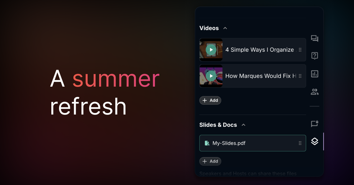
A summer refresh 🎨

Over the past few weeks, we’ve polished every aspect of Crowdcast— from the event page to dashboards, analytics, and settings. We’ve also added some delightful new interactions along the way.
Here are some highlights:
- The studio tab has a fresh new look, and now animations highlight actively shared elements like slides, videos, titles, and questions.
- Chat actions are now simpler to use.
- It’s easier to manage audience roles and stage invites
- The audience bar makes it clearer who is actively watching.
- The billing & usage page is streamlined for easier navigation.
- Attendees can now change their email more easily.
- The CTA buttons now have subtle animations to bring the attendees focus to it.
We’re rolling these updates out gradually. Once you see them, let us know what you think!
✨ Improvements
- Better react-mojis in chat
- Improved the performance of switching tabs in the event
- The replay recording is now cleaner (we removed audio and signal indicators) and has a new intro slide
- The custom fields form is more clear about what data is included by default
- The event landing page has an animated CTA button to help increase the registration rate on your events
- Renamed “Studio sound” to “Music mode” to make it more clear what it’s used for
🐞 Fixes
- Fixed an issue with the checkout flow for free tickets on mobile
- Fixed an issue affecting push notifications on the beta android app